Role
Research, UX
Team Members
with Tong Wen
01 - Problems
Complex Experience that Causes Confusion
TMSearch is a search engine website for trademarks. The company wants to attract future entrepreneurs who are in the process of setting up their businesses to browse through the website and gain inspiration for their logo, names, and also other information. The ultimate goal is to provide an easy registration platform for entrepreneurs to purchase the rights for their trademarks. The current website needs a complete redesign as the interactions are not user-friendly and information organization is chaotic. Users also complain about the aesthetics.
02 - Solution
Redesign Experience. Rebrand Visuals.
Spanning across three weeks, the fast process requires our team of two members to think fast and move fast. Through rapid prototyping and iterations, we have successfully delivered a rebranding of the TMSearch website in terms of interaction experience and also visuals.
03 - Initial Investigations
Task Flow and Usability Analysis
TMSearch has an original website but it requires complete rebranding. Upon first investigating the website, we have idetified five main areas for improvement:
1. Outdated visual design which is less attractive for the customers.
2. Information organization is chaotic and not easy for people especially first-time users.
3. The user notifications are very confusing and therefore hard to navigate on the site.
4. Some of the interactions are too complicated and require lots of recognition on user's end.
5. The filtering is used by very few people but it takes up a lot of space that distracts customers from actually achieving their ultimate goal.
04 - Design Process
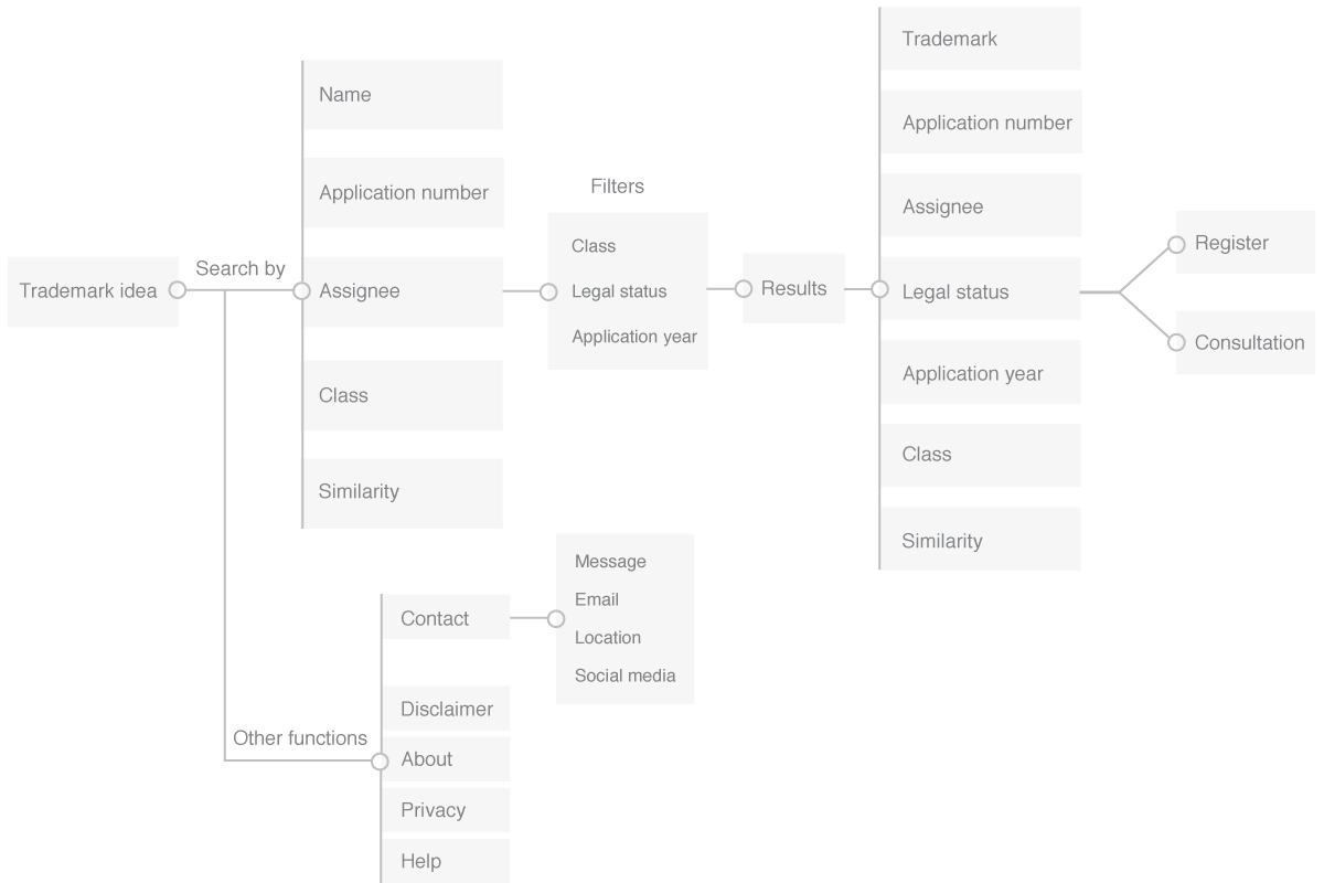
01 - User Flow Redesign
Based on the initial investigation, we realized that the original user flow is way too overwhelming for users to achieve the simple tasks they are trying to accomplish. So we decided to start by optimizing user flow.
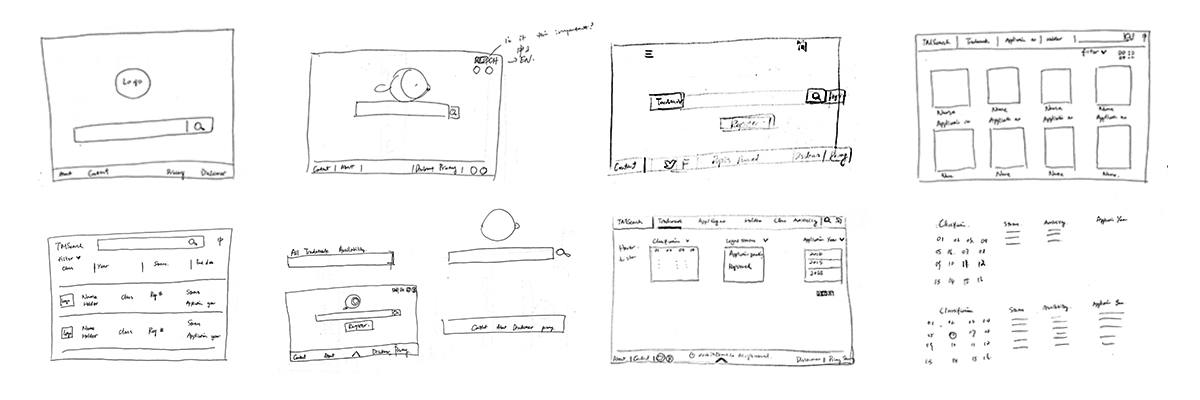
02 - Brainstorm and Sketches
After the initial investigations and confirming user flow, we started to brainstorm different solutions. We first started with sketching our ideas for the three main pages.
03 - Wires
After finishing sketches of interfaces, we moved onto digital wireframing to realize our design of the user flow in order to start making interactive prototypes.
04 Iteration -
Usability Testing and Wireframe Refinement
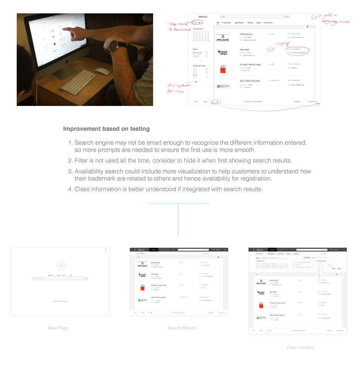
After the interactive prototype is produced, to verify our design concept and user flow validity, we conducted usability testing with three users in total, iterated two rounds, and made improvements each round.
05 UI Design -
Consistent Visual Designs Across All Platforms
Since we were designing for different phones, touchpads and also mobiles devices on the market. They all have very different dimensions and screen resolutions. One of the big challenges we faced was to make sure our visual design looked good on all devices. We made sure our design follow a proportional grid so that it's scalable to different resolutions.

