


Client
Tile
Type
UX/UI, Interaction design
Role
Design lead
Improve Revenue on Tile Mobile App
Initially, Tile has been relying on the website for e-commerce revenue and had no opportunities to purchase hardware pieces on the Tile mobile app. This is a huge opportunity miss and hence the goal is to create intuitive experiences in the Tile mobile app to guide Tile hardware purchases and hence drive the overall revenue stream.
Opportunity 01 -
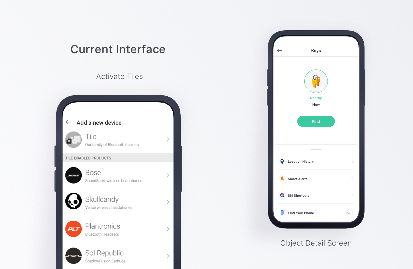
Missed Opportunity with Prompting for Tile Purchases
As stated in the introduction and also seen below in the image, the Tile app has always been super utilitarian and focused mainly on finding items. It is relying on customer initiative to go to the Tile website on their phone when they need to purchase more Tiles.

Opportunity 02 -
How to Guide People to Activate More Tiles?
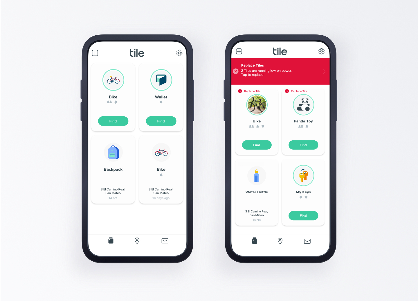
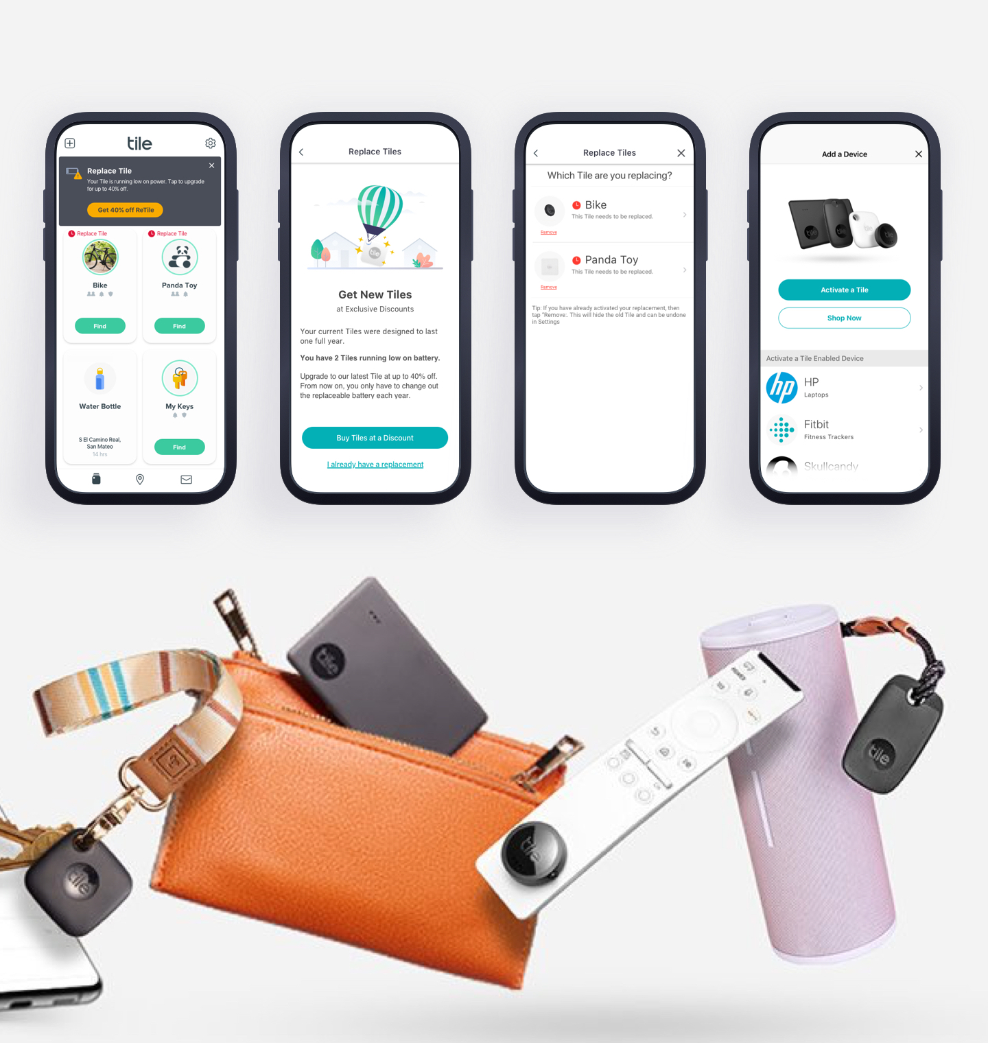
The app is functional, but not exciting to use. As you can see here, some of the mechanisms that were in place to help prompt more Tile activations have been more like warnings rather than helpful guides.

Opportunity 03 -
The Full of Friction Purchase Flow
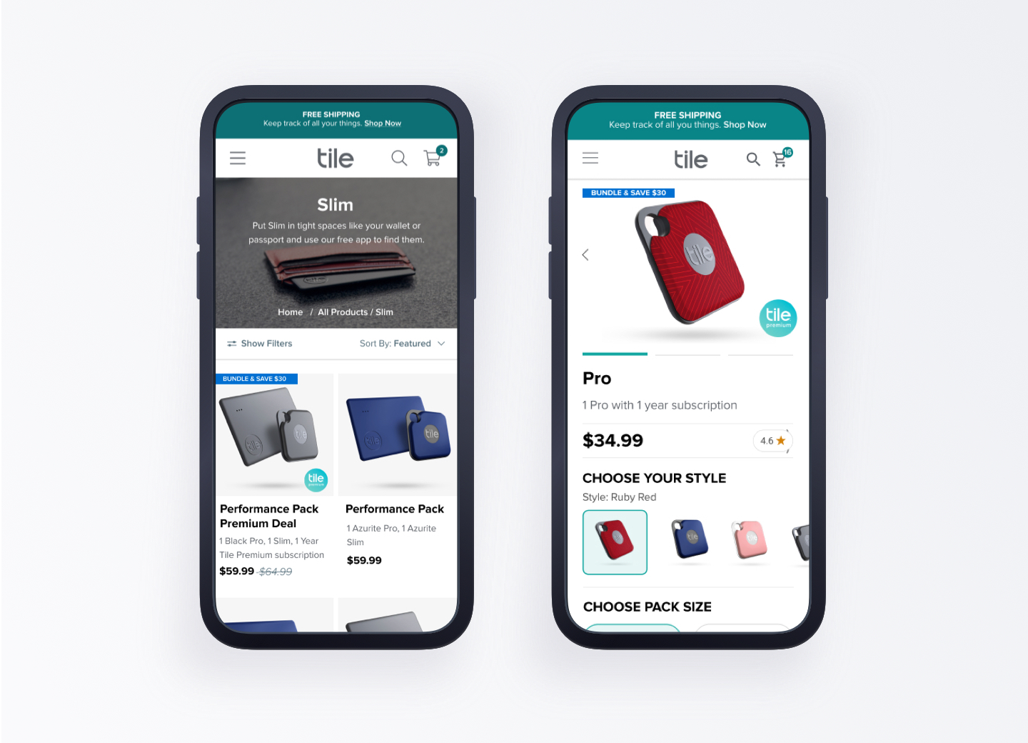
1. The original Tile website has a product page that only shows one product at a time. And with increasing SKUs, customers are finding it's tedious to find the Tile they are looking for.
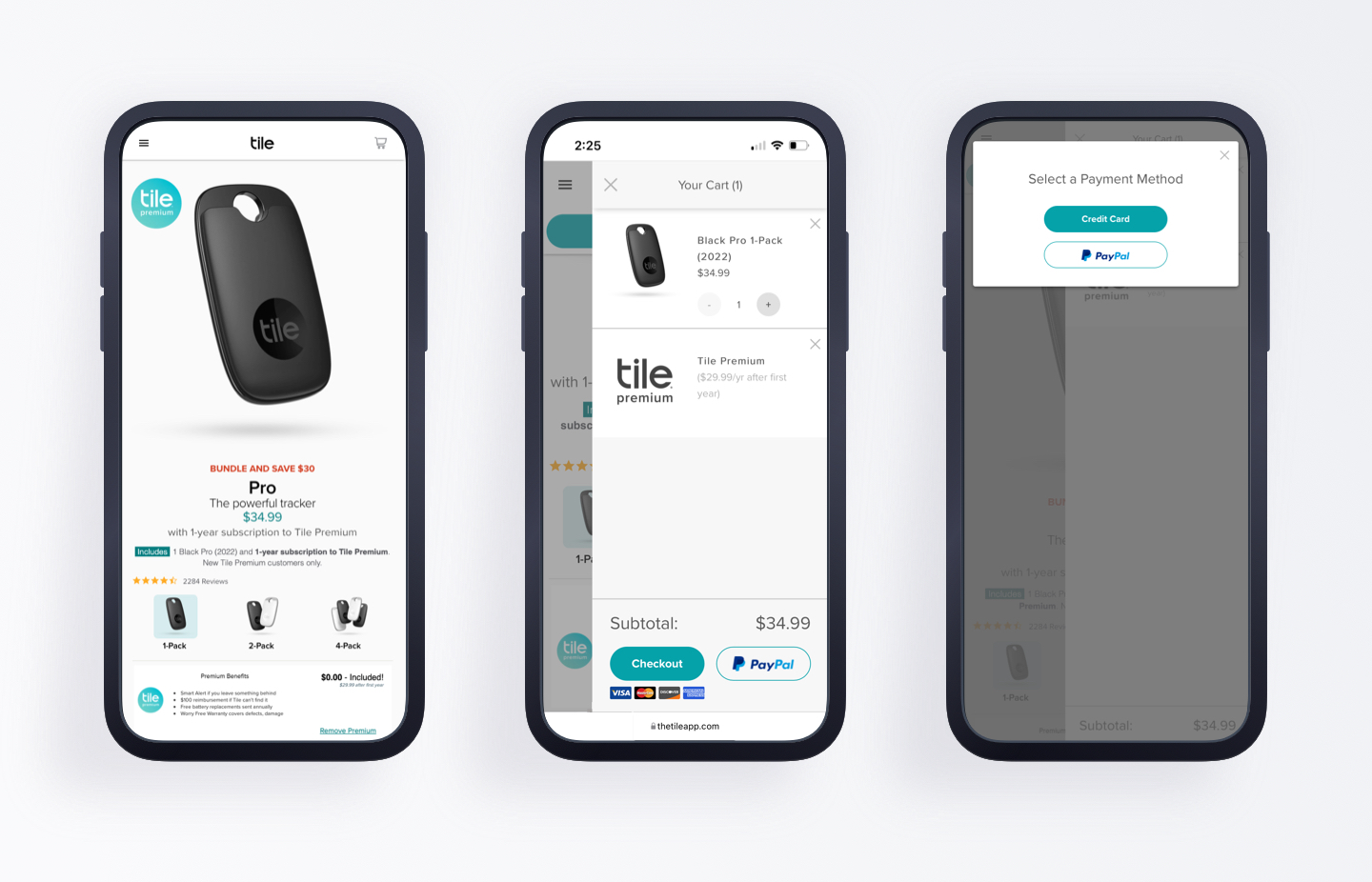
2. The checkout experience is just full of friction. First, there is the cart with multiple payment options on the bottom. After clicking checkout, customers are prompted again to pick a payment method. The following steps also include many friction points such as long forms for filling addresses etc.

Improvement 01 -
Intuitive Shopping Entry Points
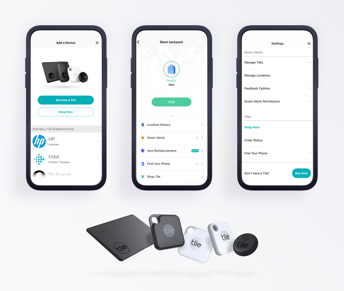
The main improvement proposed by me is to have a more prominent Tile presence when choosing a product to activate. While also adding a shopping opportunity if there's a need to. In addition, more entry points are added into the app where appropriate.

Improvement 02 -
Personalizations
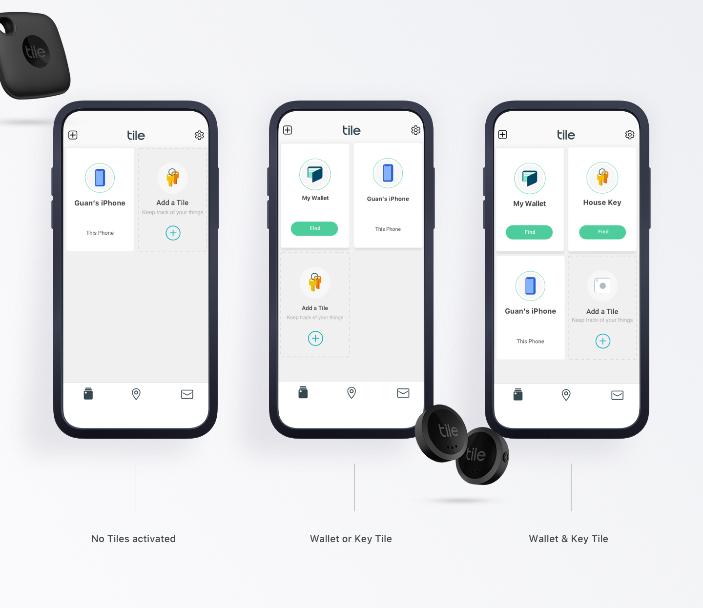
Based on data, over 95% of customers have 0 - 2 Tiles. And the top categories for Tiled items are keys and wallets. One hypothesis is if I add more inspirations for what Tiles they could add to, this will help to drive more Tile activations on the app and hence more engagement. The inspiration is highly customized to cater to what they already own.

Improvement 03 -
More Joyful Replacement Flow
As shown previously, when a Tile is running low on power, the prompt to replace it has a red warning banner that is just alarming. Hence my proposal is to have a more pleasant replacement prompt. While keeping the home screen banner prompt, a guided approach is taken after clicking on the banner. The customer is taken to an introduction screen to understand Tile's discounts or choose to activate a new Tile. Along the way, intuitive shopping opportunities are also included.

Improvement 04 -
More Organized. Faster Process.
The previous design was mainly focusing on showcasing each Tile product but not optimized for shopping. The improved shopping flow has more products on the screen and hence easier to browse through all items. Also improved the product detail page to help better make the decisions about the exact Tile for purchase.

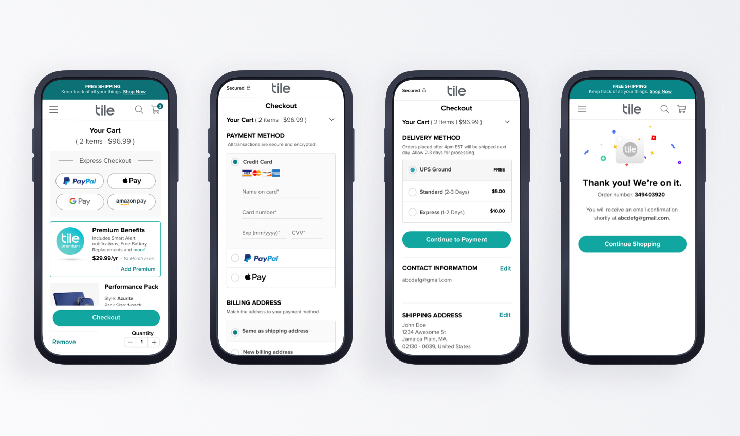
Improvement 05 -
Frictionless Checkout Flow
Combining common checkout flow process standards with constant iterations and testing, the final checkout process is highly optimized. Customers are given the choice to express checkout in their cart and accordion-style checkout information forms keep the process to just one page.