


Client
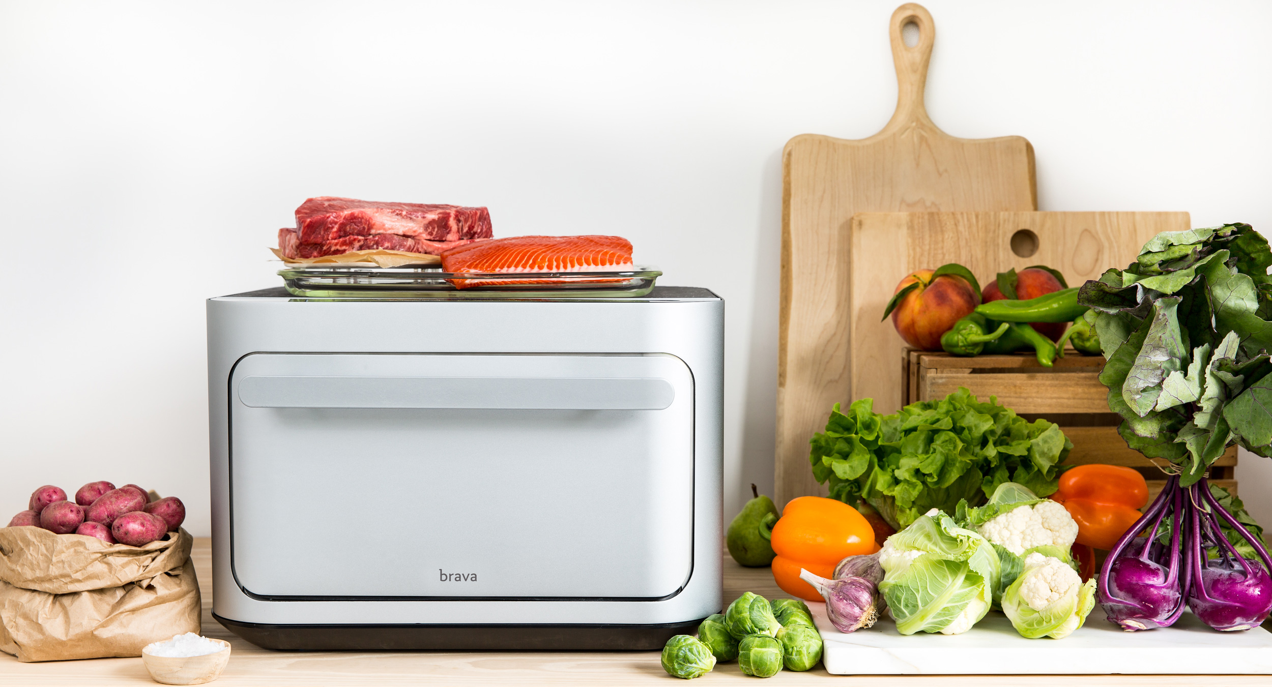
Brava
Type
UX/UI, Interaction design
Role
Design
An Intuitive Interface for Smart Oven
Brava Oven is a smart oven that cooks differently than conventional ovens. The interface controls the cook processes. It needs to be intuitive but also allows for user customization.
01 Problem -
How to Design for An Interface for Integrated Systems?
Since the interface is on a hardware product, it involves not only considering how this interface interacts with the oven itself, it also needs to consider other parts such as the probe and the different trays.


02 Process -
How We Got Here?
1. Guiding principles - I started by understanding the overall guiding design principles of the oven. Since the interface is part of the oven, it needs to be in harmony with the overall industrial design of the oven. The guiding principles for oven design are evolutionary, simple and make sure people feel technology is in service of food cooking.
2. Competitive analysis - By looking at other related products, analyzing what was successful and what wasn't, it really helps to provide insights into what's working and what's not working for IOT products in general. Through cross-comparisons, we realized that the most successful products were the ones that use simple flows and help provide lots of visual clues. Some of the products we looked at are Chefsteps, Nest, Dyson vacuums and Balmuda oven.
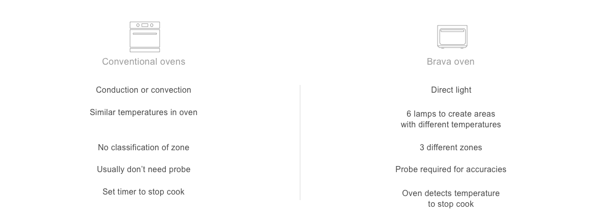
3. Brava vs. conventional ovens - Through understanding the differences in the conventional ovens and Brava oven, it helps to inform how to design the Brava oven. What are the things that conventional oven controls design could inform Brava oven?

03 Explorations -
What's the Best Guiding Process for Cooking on Brava?
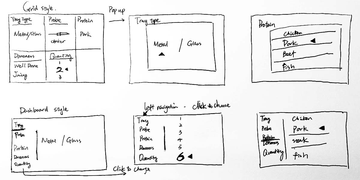
Based on the research we have done with similar products and understand of the oven as a whole, I explored different styles of introducing the cook flow. The main guiding principle is to have users be able to understand what are the main things to take note of during their cook while also helps them to understand the different possibilities of customizing their cooks. For example, they can set the doneness of the proteins, change the quantity of the meat. The 2 main directions that we explored are:
1. Grid style - display the different settings in a grid style
2. Dashboard style - with clickable tabs to switch between the different settings

04 Wires Iterations -
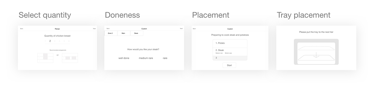
01 - Keep it Simple
For the first round of wireframe testing, I really want to keep everything simple. So that it's easily understandable for people. As seen below, the prototype is showing limited info on one screen.

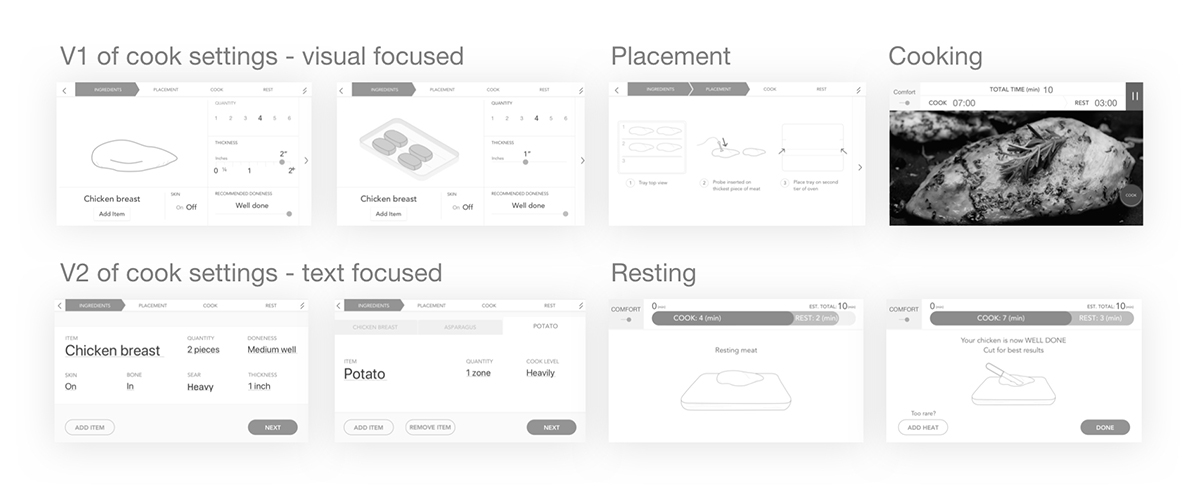
02 - Visual Focused vs. Text Focused
After the first round of user testings, we realized the info is too limited to guide successful cooks. Therefore, the iteration is to increase the amount of info presented on the screen. Therefore, I explored 2 versions, one is focused on visual representation while the other is focused on using text as instructions.

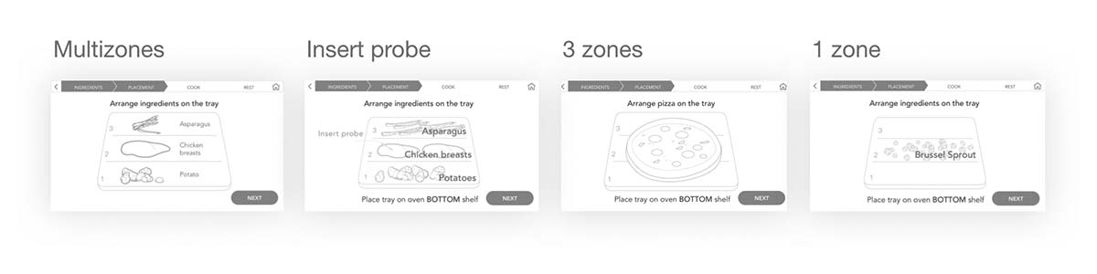
03 - How to Guide People to Place Items on Trays for Cooking Success?
One of the other problems we realized through user testings is that people have a hard time understanding zones. And in order to create successful cooks, food need to fill zones properly and the most failed cooks (mostly overcooking) come from incorrect placement. Therefore, different explorations were done to reduce this user error.

05 UI Deliverables -
Functional and Aesthetically Harmonious
The final shipping UI looks like below. Visually, the screen needs to blend in nicely with the industrial design. So that black is chosen as the background. Renders are used to accurately portray the different specific instructions. Minimal color is used, mostly white colors to keep interface look simple. Different colors (green, orange and red are chosen to represent different states).
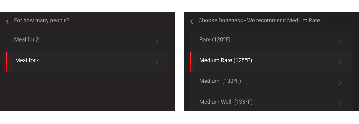
01 - Choose the serving size and set doneness level

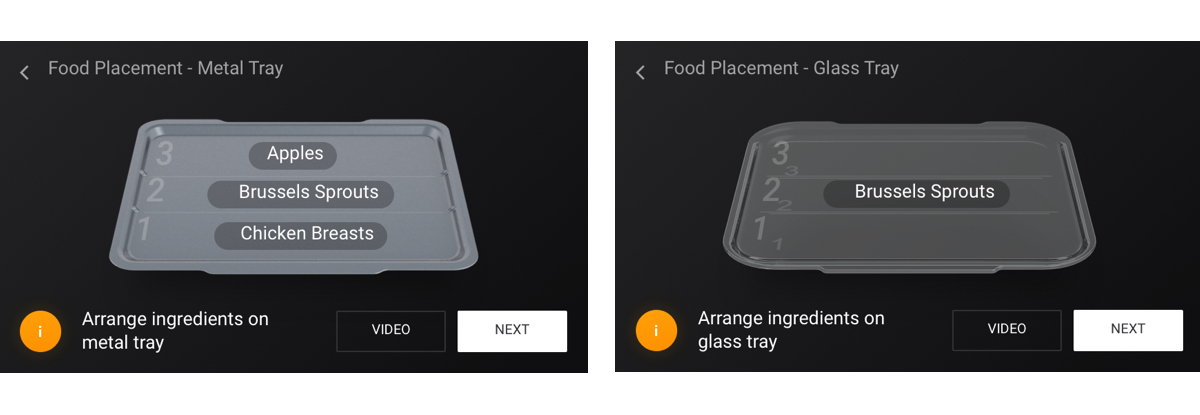
02 - Metal or Glass Tray?

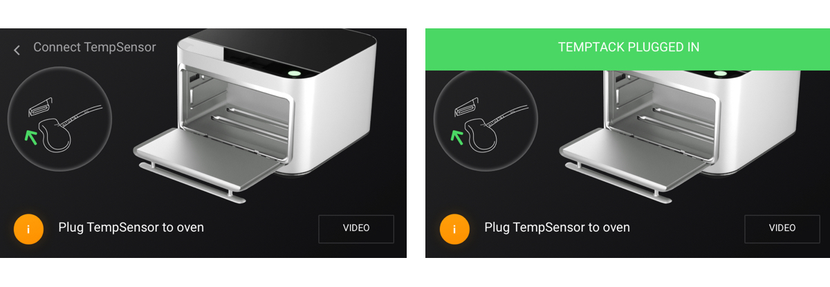
03 - Connect the Probe

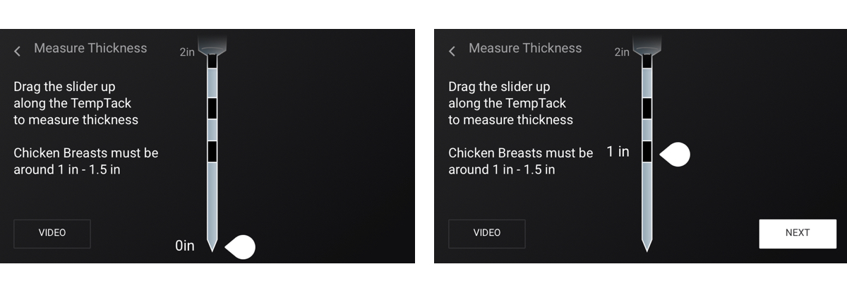
04 - Measure Protein Thickness

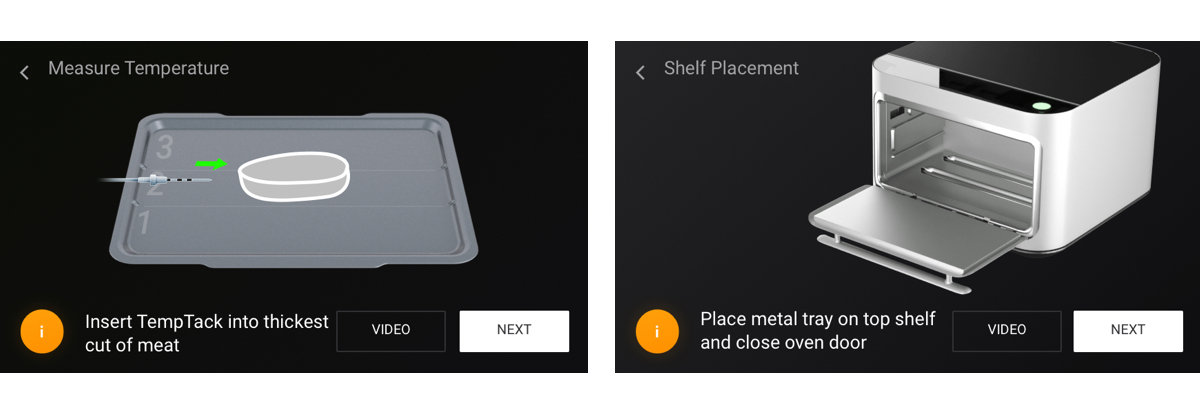
05 - Probe Insertion Instructions and Shelf Placement

06 Improvements -
What's the Best Process for Shipping New Product?
After shipping the product, I realize there are still lots of things that could be improved. Due to the timeframe of shipping the product, not all improvements could be done before shipping. Here are some thoughts:
1. It's worth exploring the dashboard direction again. Since this flow is step by step, it's easier to follow but as people get more familiar with the cooking flow. They might not have to go through the whole flow.
2. The placement screen maybe could explore options such as color fill or hash lines filled areas to indicate the necessity to completely cover the different zones.
3. Have a checklist summary for all the steps so that it's immediately understandable for people what are the necessary steps to reduce cook errors.
07 Reflections -
Redefining "Smart".
I really enjoyed working on the Brava oven UI design. It's really challenging, especially with hardware technical difficulties. A lot of iterations and refinements need to be made before shipping the product. It's definitely a lot more challenging than digital products. However, this really trains me to have an athlete mind and be flexible with problem-solving and constraints.
Designing for smart devices is enlightening. It's important to understand what's people's expectations for smart devices. People have very different expectations about what "smart" means. Therefore, understanding that expectation can help to set some direction first.