Client
Juphoon Inc,.
Type
UX/UI, Interaction design
Role
Design lead
Improve Overall Customer Experience and Focus on Developing New Features
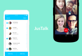
JusTalk mobile application started with a B2B approach, and it was a more feature-oriented product. In 2015, I had the fantastic opportunity to begin working on its redesign. The primary challenge of this redesign is to improve the overall product experience for JusTalk customers and, at the same time, focus on coming out with new features to attract more customers.
01 My Solution -
Improve Emotional Appeal
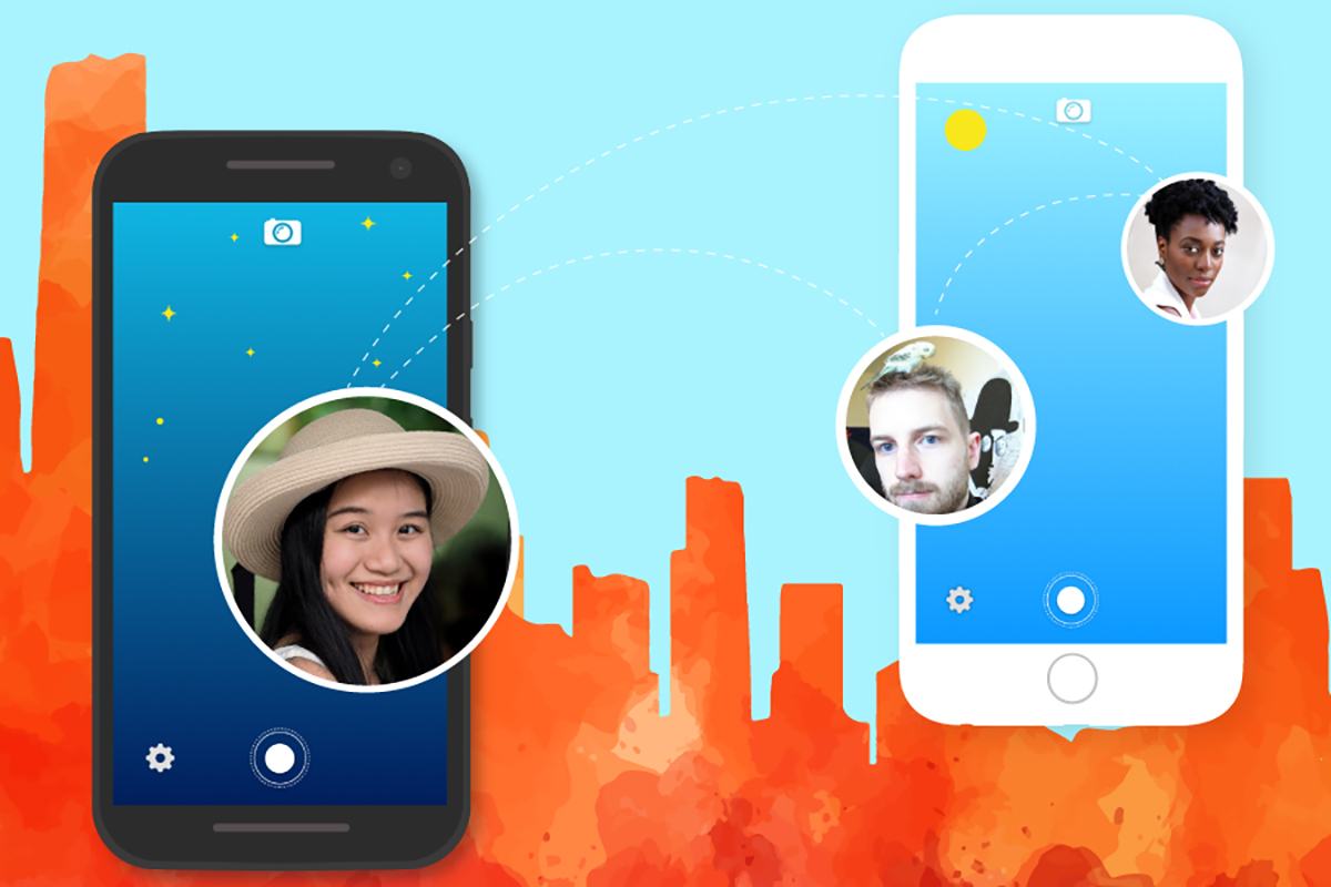
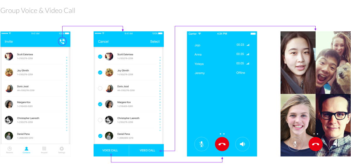
The redesign of the JusTalk app focused on improving overall user flow and making customers feel a more emotional attachment to the application overall instead of the initial "cold/industrial" feeling. Also, the prominent feature is the group call function.
02 Process -
How We Got Here?
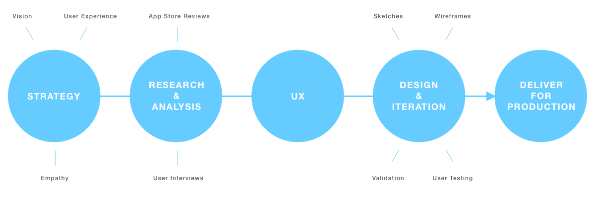
The process took about 2 months and we took overall 5 steps to arrive at final deliverables. However, the project does not just stop here. After the new version of app is released, we monitored different feedbacks to iterate our designs overtime to optimize user experience.
03 Initial Investigations -
01 - App Store Reviews
We started our initial investigations with the app store reviews since it was the most direct way of getting an overall standing of what are the current advantage and shortcomings. Below are the main insights for the app store review:
1. Overall video call quality is great but some of the user flows are confusing for people.
2. They really love the advantage of cross-platform so that people on iOS and Android can connect to each other without any problems.
3. People love the fact that any phone contacts are automatically added but they are not sure what's a good time to call the other party as it does not show their status (eg. if they are online, they are busy etc).
4. A large proportion of the current customers expressed their wish for group call function to be added.
5. Small details lack attention especially in terms of how they can invite friends when call quality is not good and also if there are interruptions during the calls.
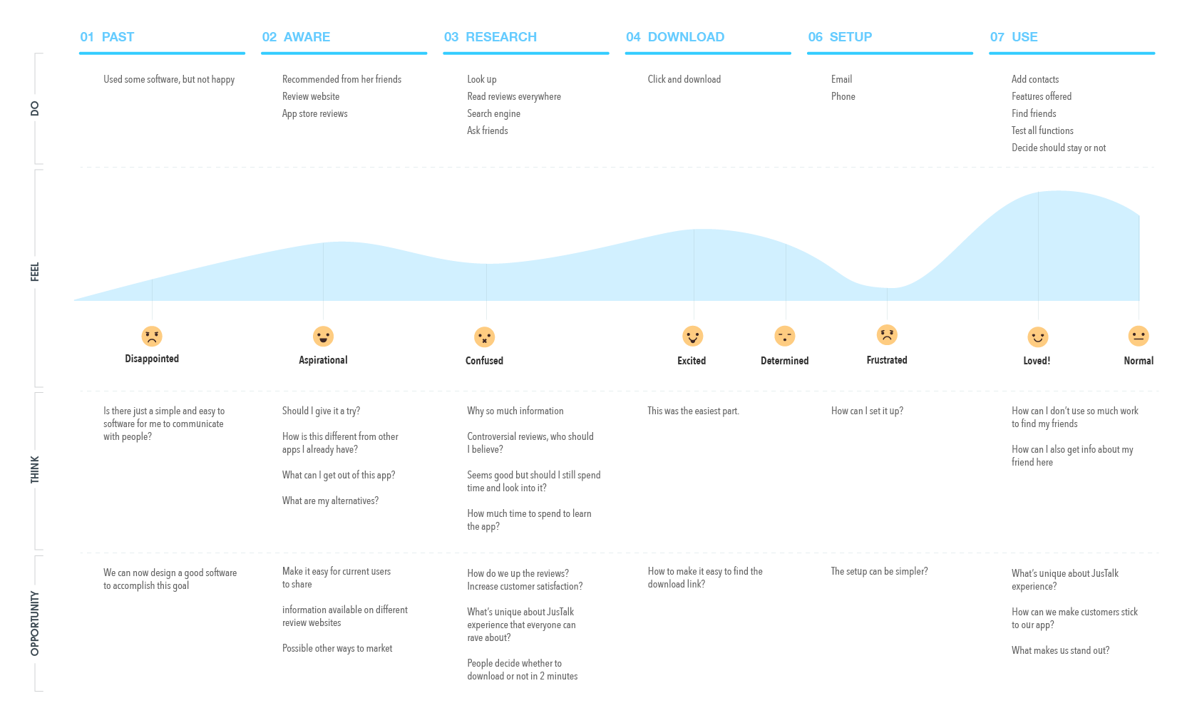
Based on this initial feedback and gathered details, we crafted a user journey map for JusTalk's current experience at that time to get a better understanding of the pain points.
02 - User Interviews and Surveys
We started our initial investigations with the app store reviews since it was the most direct way of getting an overall standing of what are the current advantage and shortcomings. Below are the main insights for the app store review:
1. Overall video call quality is great but some of the user flows are confusing for people.
2. They really love the advantage of cross-platform so that people on iOS and Android can connect to each other without any problems.
3. People love the fact that any phone contacts are automatically added but they are not sure what's a good time to call the other party as it does not show their status (eg. if they are online, they are busy etc).
4. A large proportion of the current customers expressed their wish for group call function to be added.
5. Small details lack attention especially in terms of how they can invite friends when call quality is not good and also if there are interruptions during the calls.
Based on this initial feedback and gathered details, we crafted a user journey map for JusTalk's current experience at that time to get a better understanding of the pain points.
04 Design Process -
01 - Brainstorm and Ideation
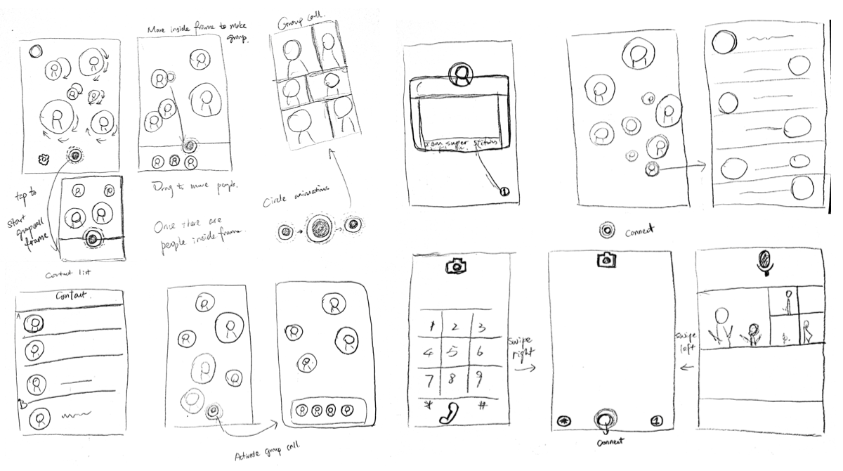
Initially, I started with different ideas and concepts that could be added to the JusTalk application. Especially the group call function. How can we integrate the group call function seamlessly into the current flow? I asked myself. Also, it is very important to tear apart and regroup some of the features.
02 - Wireframe and Prototype
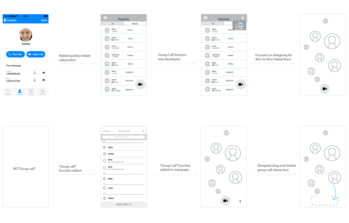
With these sketches, wireframes are produced to create initial prototypes to test our research findings and if the designs are matching customer needs. Test participants are given interactive prototypes to interact with and therefore much easier for them to point out what they like and don't like.
05 Iterations -
User Testing and Refining User Flow
After the interactive prototype is produced, to verify our design concept and user flow validity, we conducted usability testing with ten users in total, made four major rounds of iterations, and improved upon each iteration.
06 UI Designs -
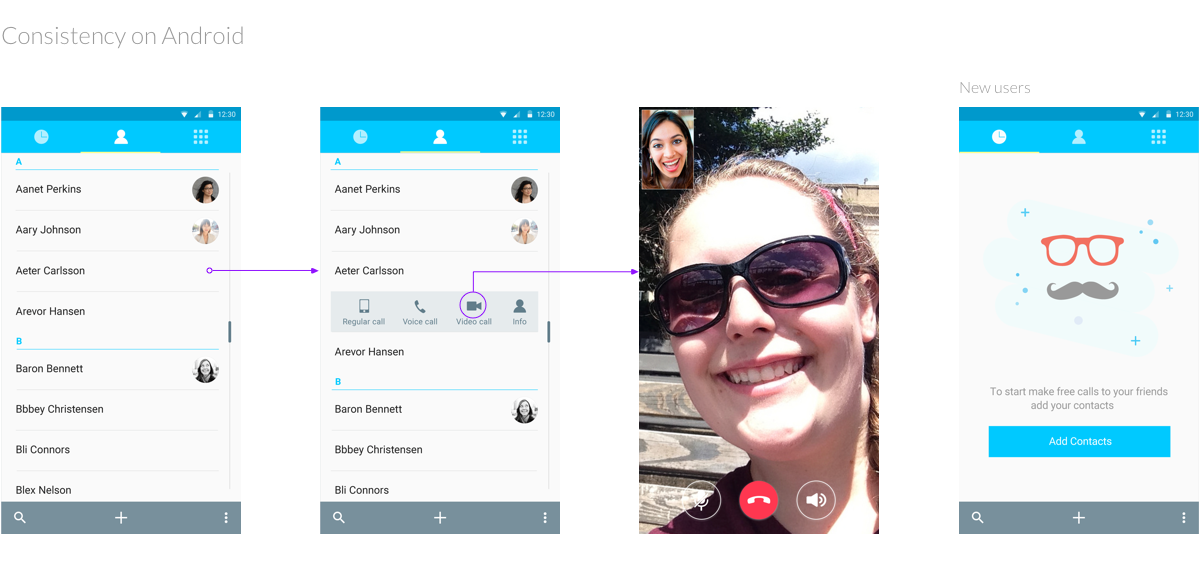
Create Consistent Experience Across Platforms
Since we were designing for different phones, touchpads and also mobiles devices on the market. They all have very different dimensions and screen resolutions. One of the big challenges we faced was to make sure our visual design looked good on all devices. We made sure our design follow a proportional grid so that it's scalable to different resolutions.

