Client
Tile
Type
UX/UI design
Role
Designer
How do people keep track of items with two or more Tile-enabled parts?
Tile is a Bluetooth tracking device to keep track of items and prevent losses. It has been tracking things with only one part per item. With true wireless earbuds, one item has at least two parts. The problem is to design a solution to keep track of the item with two or more parts while keeping the interaction pleasant and consistent with the existing experience.
01 - Challenges
Uniform and scalable experience
The biggest challenge for this project is to ensure the tracking of true wireless earbuds has a unified experience compared to other Tiles' current tracking experiences. One of the challenges is that the original design is only optimized for one item at a time. The other difficult task is to ensure the new design can accommodate two or more parts tracking at one time. Hence, making this project more complex in terms of limitations and logic.
03 - Impact
Expand tracking capabilities and Tile partnership
The most significant impact of this project is expanding Tile tracking capabilities. While Tile has been the industry leader, it has been tracking items with only one part. Designing for multiple parts is thinking for the future. In addition, this project helps to support more partner products in term drive more partnership possibilities.
04 - Initial Ivestigation
How do people use wireless earbuds?
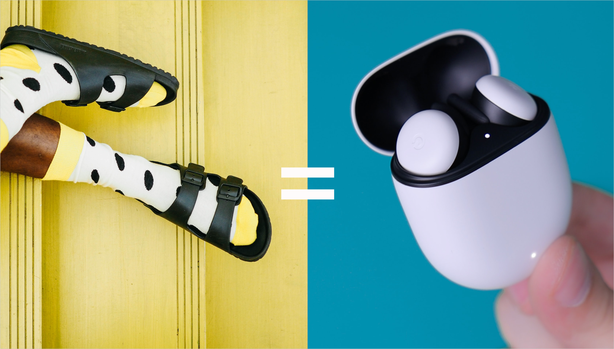
It’s a pair.
Socks - people usually see them in pairs. Therefore, we only need to consider the necessary parts that need to be considered individually.
When people buy socks, they buy in pairs. It’s a pair.

05 - Use Cases
Identify and audit use cases
After brainstorming, gathering feedback, and understanding technical limitations, I realized the leading solution for the problem would be to make sure the design could be simple and yet covers the primary use cases for keeping track of two or more parts of the true wireless earbuds. Therefore, a matrix mapping out the use cases is done to ensure all the use cases are accounted for.
06 - Flow Map
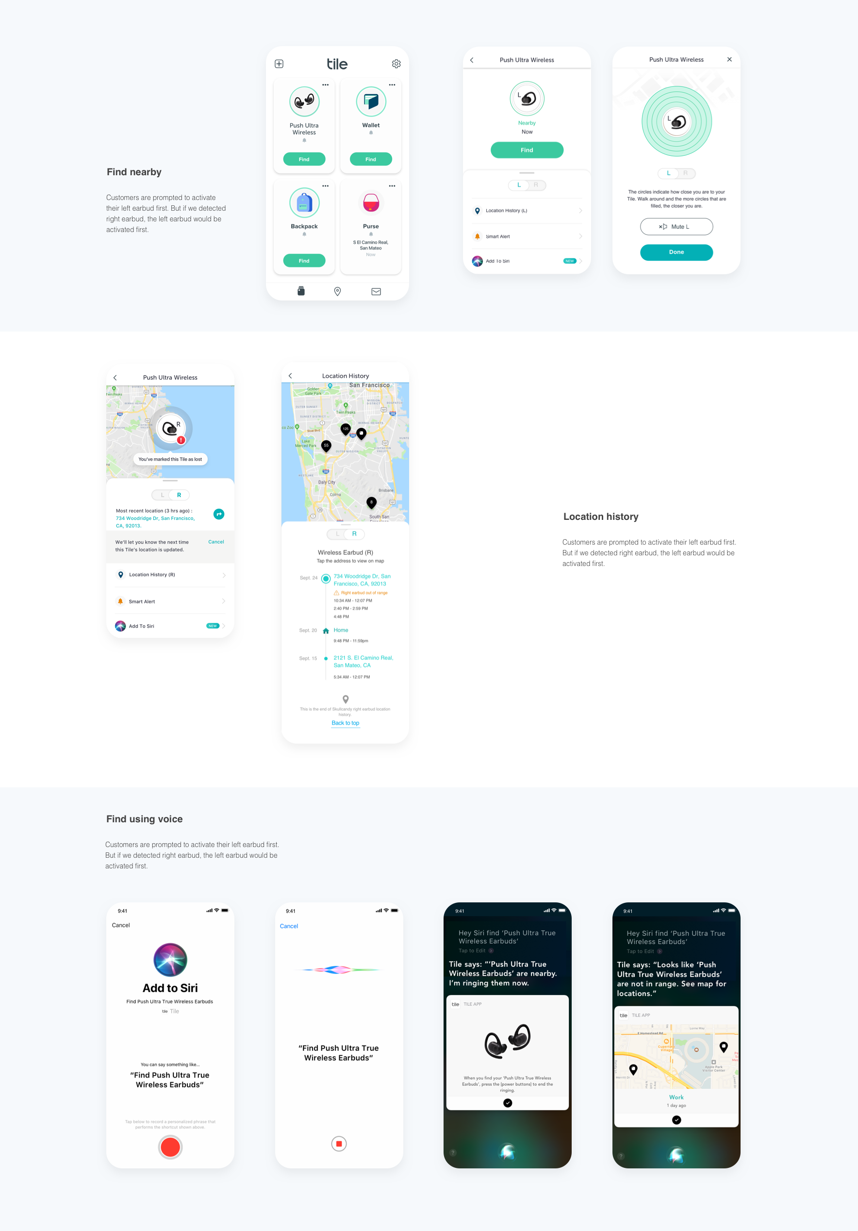
Designing for majority use cases
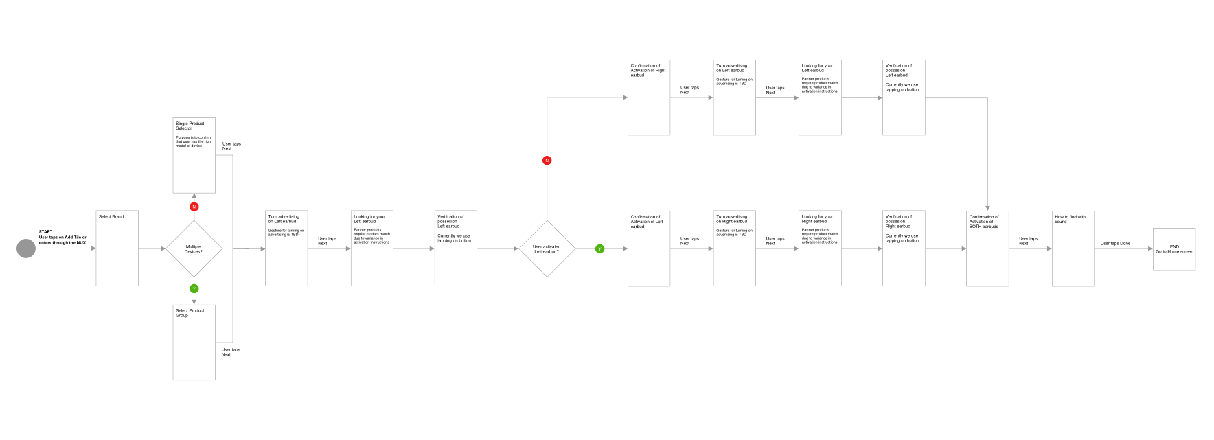
Since tracking true wireless earbuds is logically complicated and involves many different use cases. Before designing all the screens, a flow map clearly maps out the main flow and logic to optimize the happy path to confirm the feasibility and limitations with the broader team.
07 - Brainstorm
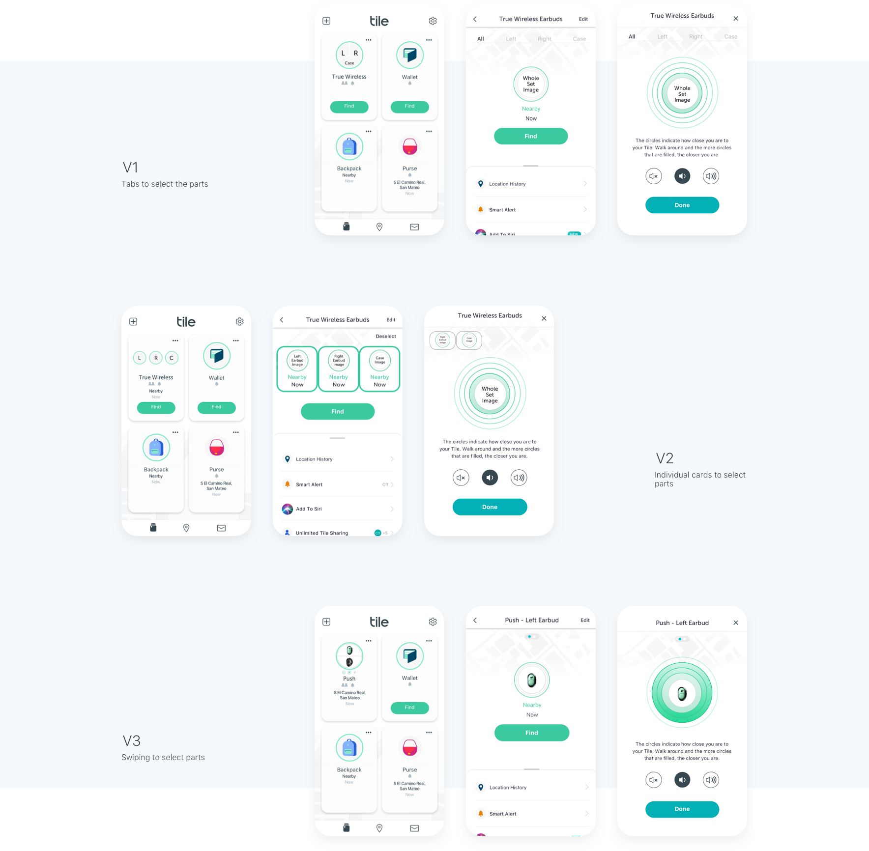
How to navigate between different parts?
Limiting people's interactions opens up many creative solutions to problems. The aha moment came when I realized that the focus had been on adding the clue for the other parts on the empty space in the object detail section. However, we have a new object detail screen, which limits how we could design this unique interaction.
08 - Usability Testings
Which one is the best design?
After gathering feedback, testing prototypes, and iterating on the designs after the first few rounds of feedback, I wanted to validate our hypothesis and methods. The goal is to find the best version that communicates this Tile has multiple parts and is easy for people to navigate between the different screens.
09 - Final UI
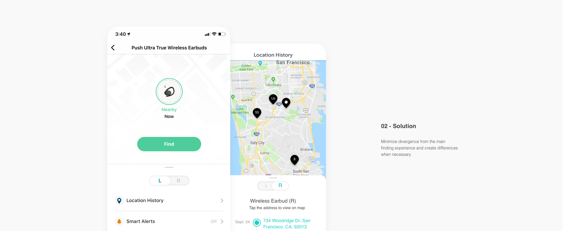
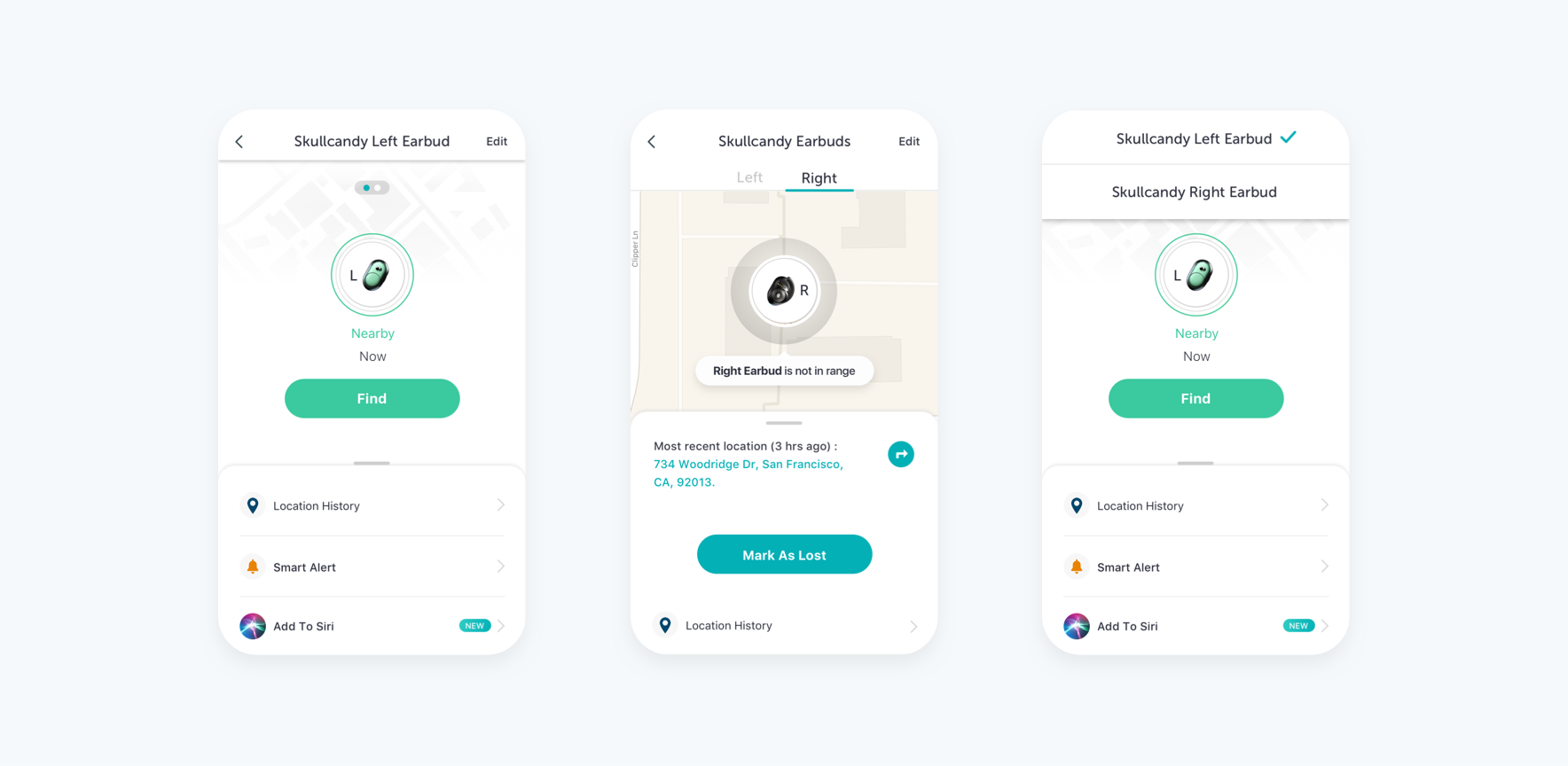
Toggle to switch performs the best
After many rounds of iterations and usability testing, version 2 is the easiest to understand. People can navigate between the left and right earbuds to see the different information available. Hence moving forward with this version and the rest of the flow falls into place nicely.
10 - Improvements
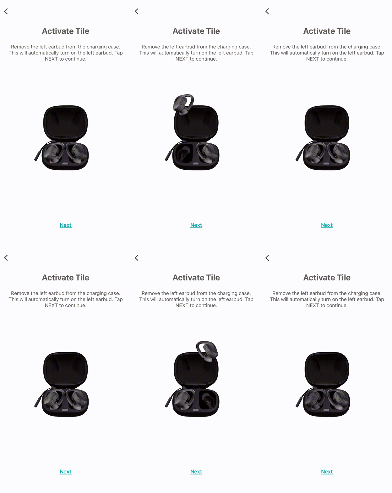
How to improve the activation rate of both earbuds
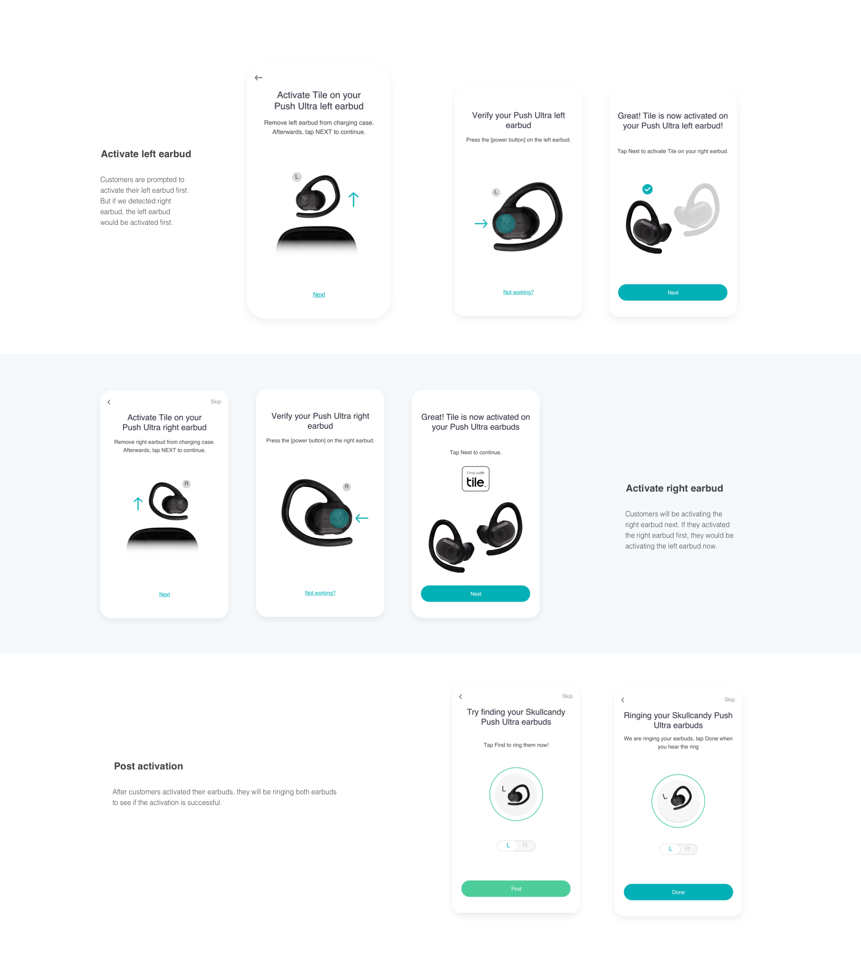
After six months of launching the true wireless feature, we noticed that 18% of customers only activated one earbud. Customer interviews reveal that people were facing the problem of time running out after they activated the first earbud. They have no idea that they'd need to put the other earbud in and take out the earbud again to trigger another activation. After implementing the video, the activation rate of only one earbud dropped to 11%. Which signals the video is helping with the confusion during the process.

