Client
Tile
Type
UX/UI, Interaction design + design system
Role
Designer
System design for the Windows app
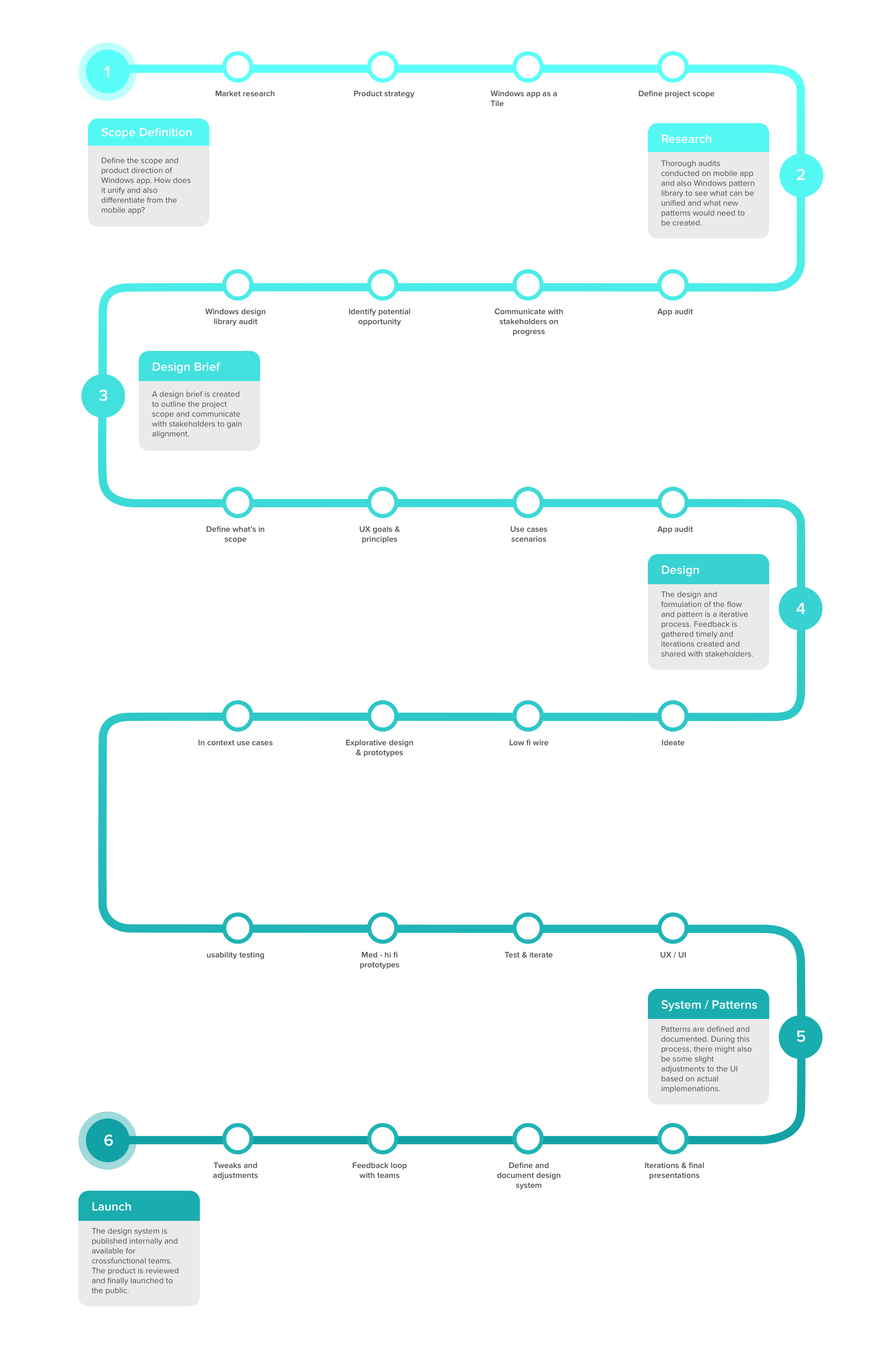
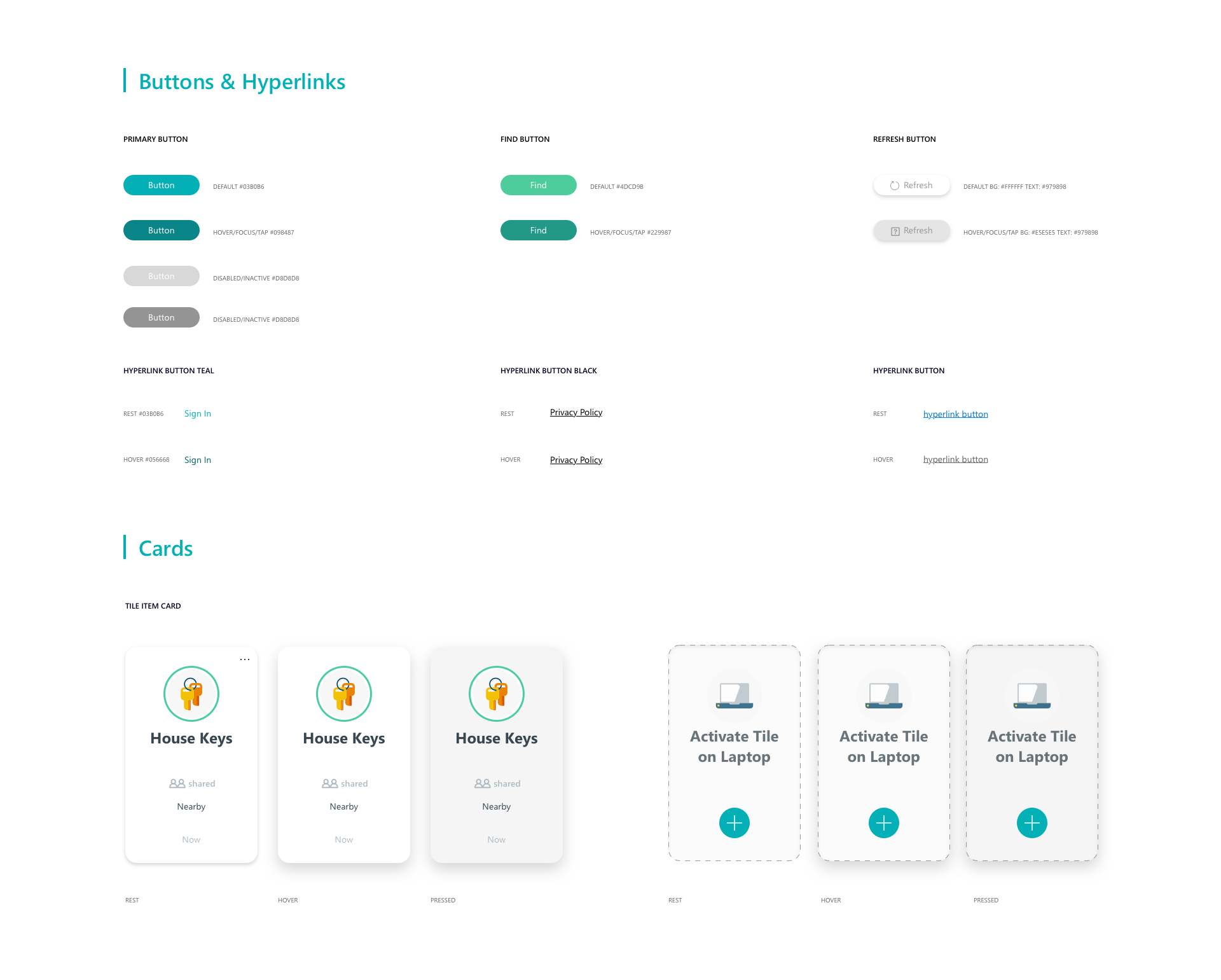
The Tile Windows App design system aims to create holistic design ecosystem rules for the new app. Keeping the current branding, look, and feel of the mobile app. On the other hand to make sure the design system scales across the windows platform.
While this system design aims to unify the different platforms, it also aims to create unique interactions on the platform as it is on larger screens and the goal for the Windows app is slightly different than the mobile app.
01 Problem -
Laptop as a tracker
The main problem we are solving on the Windows platform is to find out how people use laptops with Tile technology. How do people track and visualize different items on the laptop? Most importantly, people don't move around as much compared to mobile apps. Hence the problem is to figure out how to unify and yet differentiate between Tile windows app and Tile mobile app.
02 - Solution
Information visualization and design system
The final design uses the Windows app designed to track the items. It is to strive for a design that makes sure information is displayed in the Windows app, keeping the design elements very similar to the mobile app but diverging when necessary.
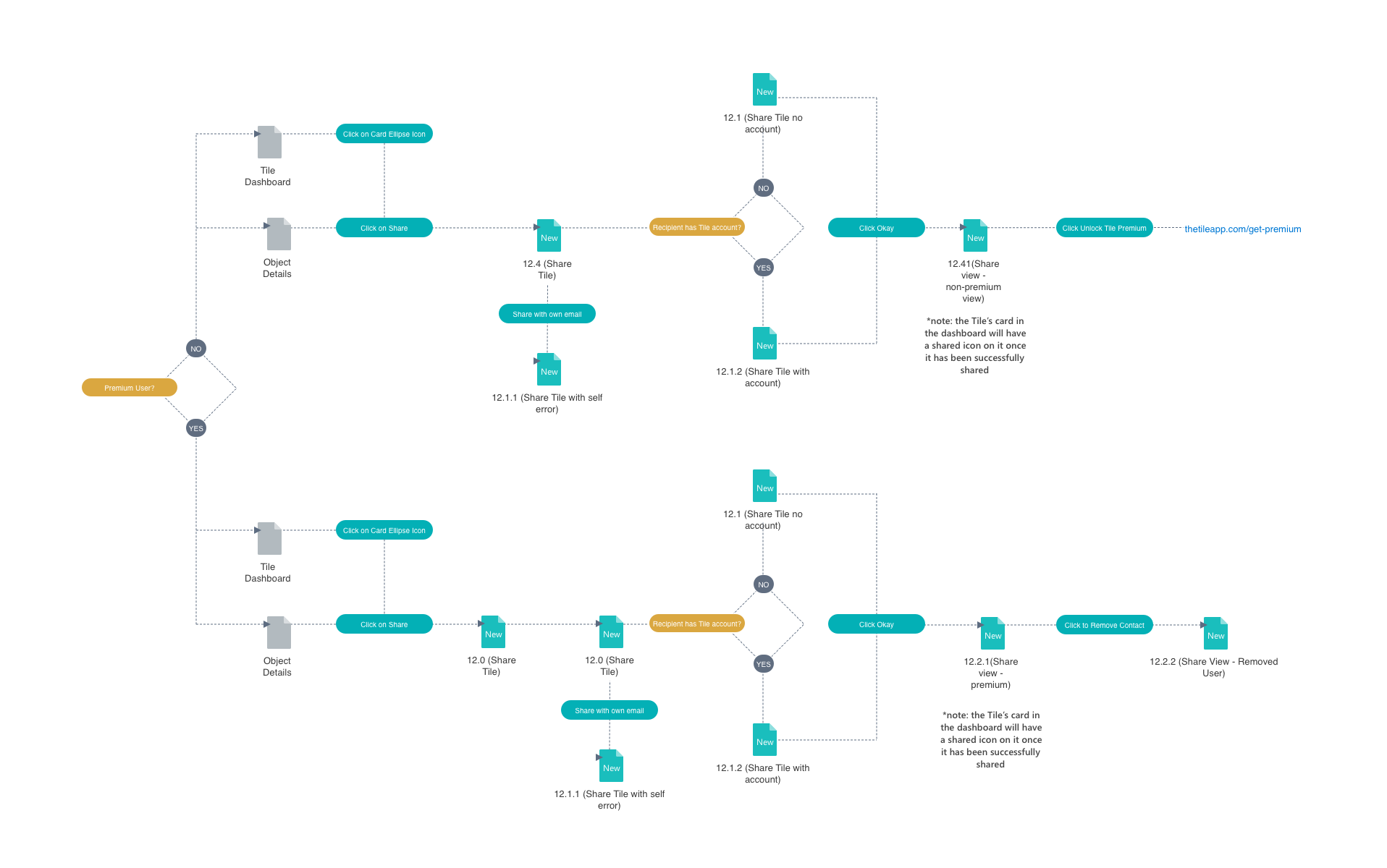
03 Flowmap -
Understand the behavior on laptop
Through customer interviews, I realized that people usually won't carry around their laptops when they are looking for things. However, when visualizing all their Tiles, a laptop has more advantages over the mobile app. Hence, the Windows app focuses more on information visualization and is capable of providing an overview of all information regarding Tiles on the dashboard.
04 Final UI -
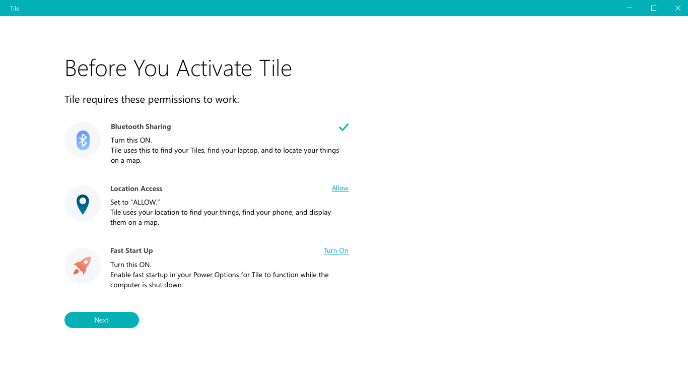
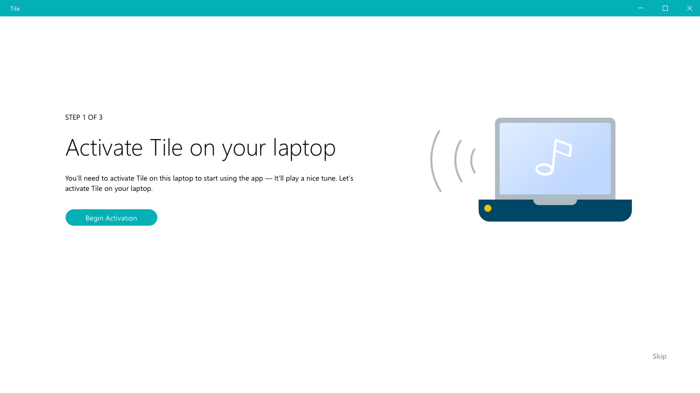
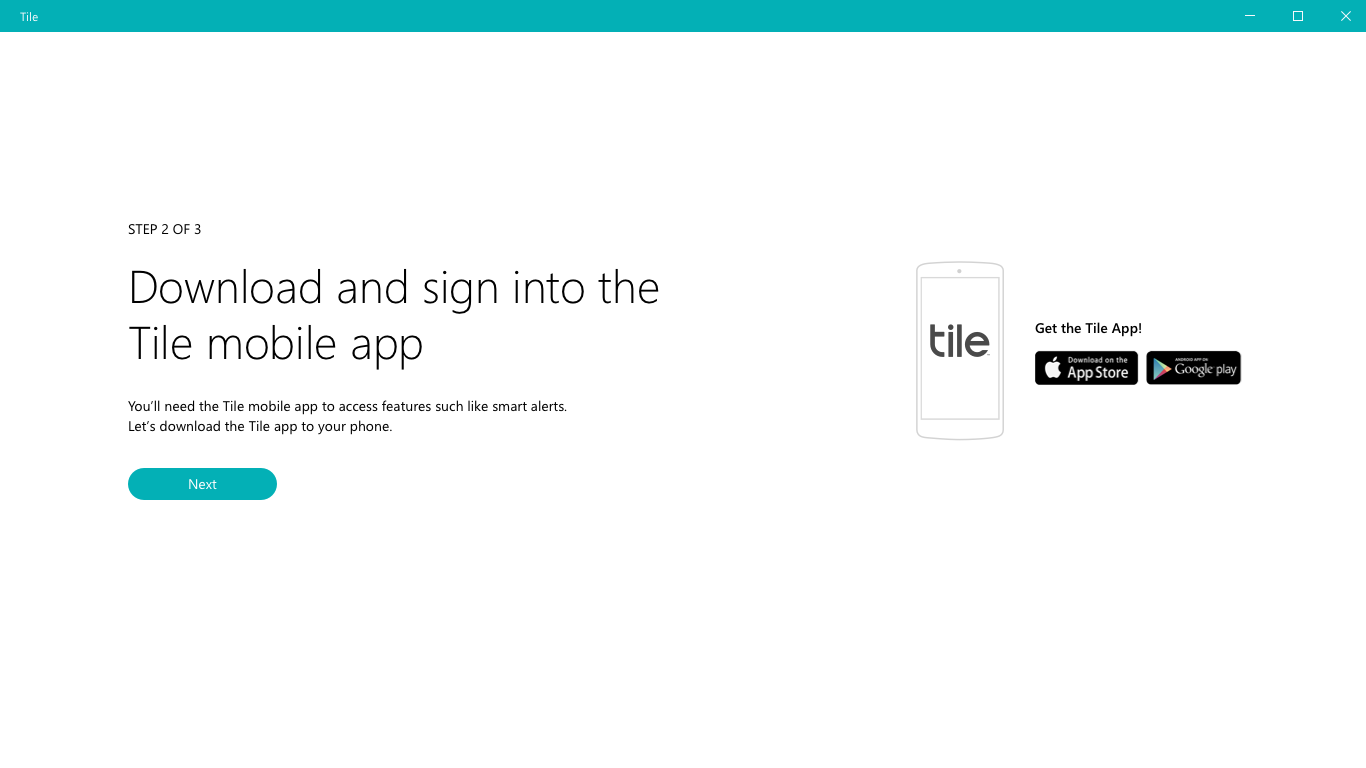
02 - Tile activation
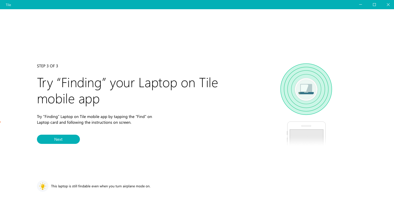
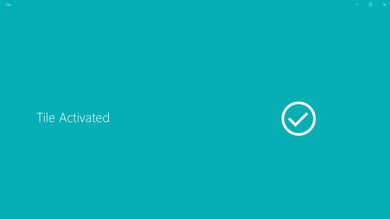
The goal of the activation process is to guide people through the process of activating Tiles on the laptop and associating to the mobile app. Hence, it's important to let it be a step-by-step process that is easy to understand.
02 - Visualizing information
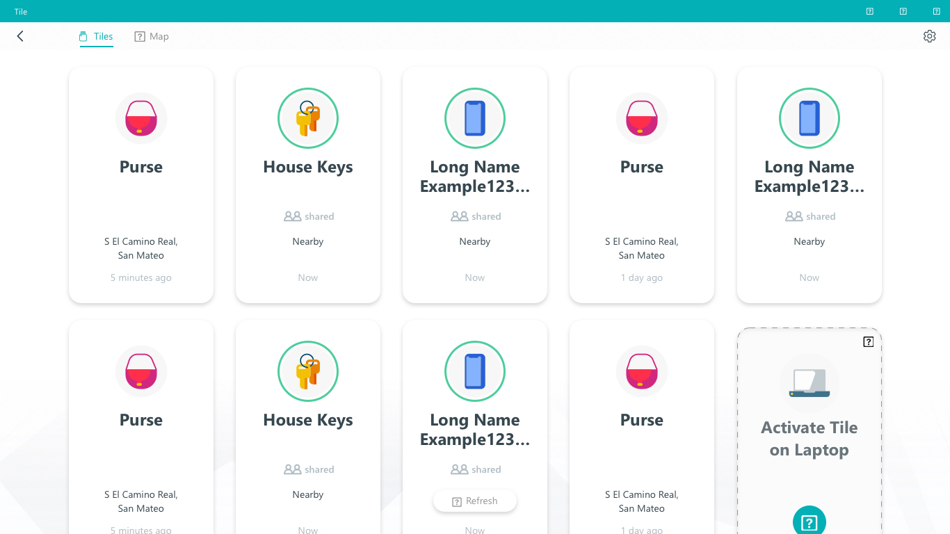
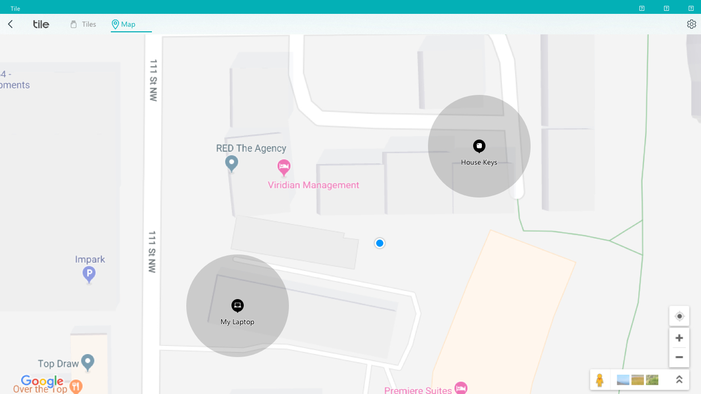
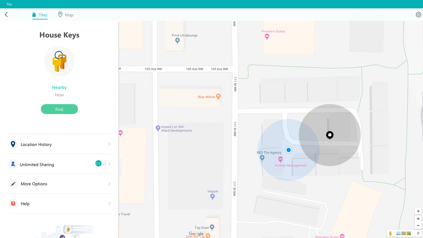
Since the main advantage of the Windows app is information visualization, the dashboard design is super important. It needs to convey the important information to customers and yet easy to understand at a glance.
03 - Design for Smart Alerts
Smart Alerts is the most important feature on the Tile premium subscription. Hence, the other major priority is to design a fluid experience for the Windows machine. This is handy since I designed the recent version of smart alerts.
05 Design System -
Uniform. Clean. Modern.
The Windows app is the first time that Tile is mapped onto a desktop view. It is important to establish a system for later design to follow. Hence the whole design process was with the mindset of creating a scalable and modular system for the future.
06 Learnings -
Comprehensive and fruitful
I went through the whole process of product development with designing for this project. From the initial market to the final launch of the product. I have also grown my knowledge and skills in setting up design systems. Part of the work also involves partnering with outside companies to make sure the product ships successfully.
